Microsoft’s had a bit of a patchy record with Windows releases, but there’s no ignoring them. Windows 10, the latest incarnation of, well, Windows, was unveiled yesterday. And yes, it IS Windows 10 – they’ve skipped over 9 completely.
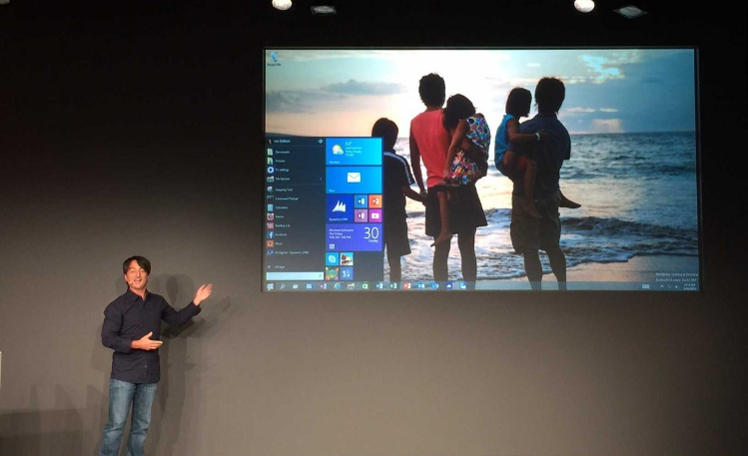
There’s some interesting tidbits to be dug out of the Verge live blog of the event, where Microsoft demoed a Technical preview – build 9841, to be precise. For starters, let’s focus on the most important thing – the interface. It looks like Microsoft has brought their attention back to where it belongs: the desktop.

For starters, Windows 10 does away with the ridiculously unpopular Start screen of Windows 8. Instead, they’ve brought the tile functionality into a sort of remodelled Start menu, returning to one of the most fundamental Windows experiences, bringing what looks like a good old list on one side and the newer tiles on the other. There search is also back there, where it belongs. In fact, they claim to pack in two different desktop environments via a feature called Continuum: there’s one desktop for the traditional user, with the mouse and keyboard, and one that’s more optimized for touch-based devices: the OS is supposed to figure out what’s what and let you pick.
Microsoft also seems to have taken useful features from other operating systems. There’s task switching made to look very much like OS X’s Expose; multiple desktops (Linux, we hear you). All in all, it looks like Windows is back on schedule. We’ve seen this before – we had Windows 2000, then Me, which failed: Windows XP, a phenomenal success, then Vista, which sort of…failed; then 7, which was a success, then 8 – mostly a failure. Microsoft’s due for another success.


GIPHY App Key not set. Please check settings